Plug-in metrics and resizing
The default behaviour
By default, Sandvox takes complete care of metrics for you. Sandvox generates a <DIV> to enclose the plug-in, and you are expect to generate HTML to fill it.
Sidebar and Callouts
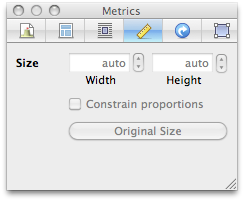
When placed in the sidebar or as a callout, the plug-in is non-resizable. All controls in the Metrics Inspector are disabled.
The exact width used depends you on the design; you should accommodate 200 px up to about 350 px. Normal HTML layout rules should be followed so that plug-in can generate whatever height of content it needs to.
Inline
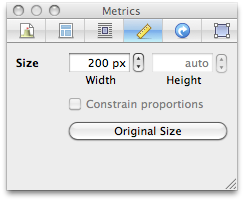
When placed inline, the width of the <DIV> enclosing your plug-in is adjustable, usually between 200 px, and auto (the full-width of the space available)
Custom Sizing
For some plug-in types, the standard behaviour isn't sufficient. For example, our YouTube plug-in:

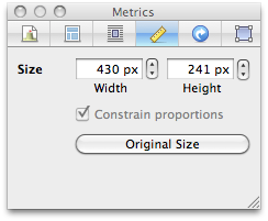
Here, the plug-in generates (from a user's perspective) a single, resizable object. People expect full control over the sizing, regardless of placement. To accomplish you have to tell the context that an element is resizable:
[context writeResizableElement:@"iframe" plugIn:self options:0 attributes:attributes content:nil];
This is enough of a hint to Sandvox for the Metrics Inspector to become fully enabled. The options available are documented fully in SVPlugInContext.h; for example you can make the element horizontally resizable only.
Further customization is available by overriding these methods:
- (NSNumber *)minWidth;
- (NSNumber *)minHeight;
- (NSNumber *)elementWidthPadding;
- (NSNumber *)elementHeightPadding;
- (NSNumber *)constrainedAspectRatio;
See SVPlugIn.h for more details.
The iFrame plug-in in our examples is a great demonstration of the above.
Initial/original size and placement
When an instance of your plug-in is first created by the user, Sandvox invokes the -makeOriginalSize method. The plug-in uses this to set its width and height to suit its content/preferences.
SVPlugIndefaults to 200 px wide, and auto heightSVIndexPlugIndefaults to auto width and height
If you set a size that is too large or small for the design in use, Sandvox will round appropriately for you.
Furthermore, Sandvox interprets the initial width to help decide where to place the plug-in:
- 200 px wide places the plug-in in the sidebar
- auto width places the plug-in inline if a sidebar object isn't already selected
(note that the specifics are subject to change, but that's the general idea)
You can override if the default behaviour doesn't suit you:
- (void)makeOriginalSize
{
    [self setWidth:200 height:300];
}
Dependencies
When you create a resizable element, Sandvox manages that dependency automatically for you. Any adjusts to the plug-in's width or height show up immediately in the web editor, without any need to reload the rest of the plug-in.
However, if other bits of HTML depend on the size (e.g. width and height are passed as parameters into a URL that gets loaded), you should still register that like you would any other dependency. For performance, while the mouse is held down during live resize, just the existing element's width and height are adjusted. But once the mouse is released, the change triggered by the dependency kicks in and the plug-in is asked to regenerate its HTML.
